So now that we have Internet at home I have no excuse for not blogging about our wedding and honeymoon right? WRONG! I am just so busy. Tonight I was serving at mens night, where Scott is currently getting his drink on and I have to go pick up his drunk butt later. Hopefully he does not call too late, and if it is late hopefully he just manages to get a ride from someone else.
So the purpose of this post is to get some help figuring out what to do for a thank-you card. I want to make a picture into a card, and you can get this done pretty cheaply from snapfish.com ($0.35 / card and there’s many coupon codes!). However I need your help deciding what image and what layout to use!
Snapfish has lots of layouts, however for what I am doing I really only like 1 layout. The card can be horizontal or vertical. I like both layouts, it basically just depends on the picture we choose.

So we have the option to use that layout and put 1 picture in the frame.
Another option is to find a place that lets you upload your own photo to the whole front of the card, and make a collage of a few pictures for it (or use the pretty collage that Brenda made for us! not sure about the kissy part). How come pictures always look grainy when I put them on? And my face looks to be an odd colour?
![]()

Okay I know the following photos are not us, I’m using them for the idea, and because I don’t have a good photo editor at home. Just picture our faces on the bodies..
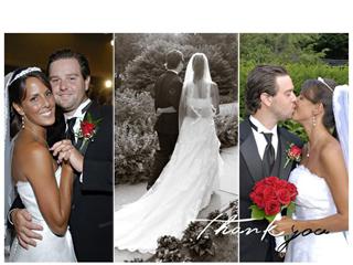
I love the simplicity of the one below. 1 picture and then Thank you. Maybe I should just go the simple route and do that.

So… any HELP!?!
EDIT: With your suggestions I have made this for you:
Likey? I was unsure of where to place the thankyou.


I like how the last one says thank you like that, but I also like the first one!
I agree with Lauren. I like the style of the card for the last one, but I like the first picture.
Ok so I made a new choice. 1 picture on front of card, the last one. I wrote thank you on it, but I had no idea where to place it..
I like the bottom one but move the “thank you” to the top right hand corner for more balance/contrast with dark brown wood in the background.
Too late for votes! The cards have been ordered. Keep checking your mailbox!
Congrats on your wedding! I love both cards you designed…I’d have a hard time picking between them actually.
PS you looked beautiful!